OPTIMUM SPORTS LOGO
OS is the sports marketing agency of Omnicom Media Group. As the agency was quickly growing, we realized they needed a brand of their own. I was tasked with creating a new logo that incorporated the ideas of sports and optimization.
COMPETITIVE RESEARCH
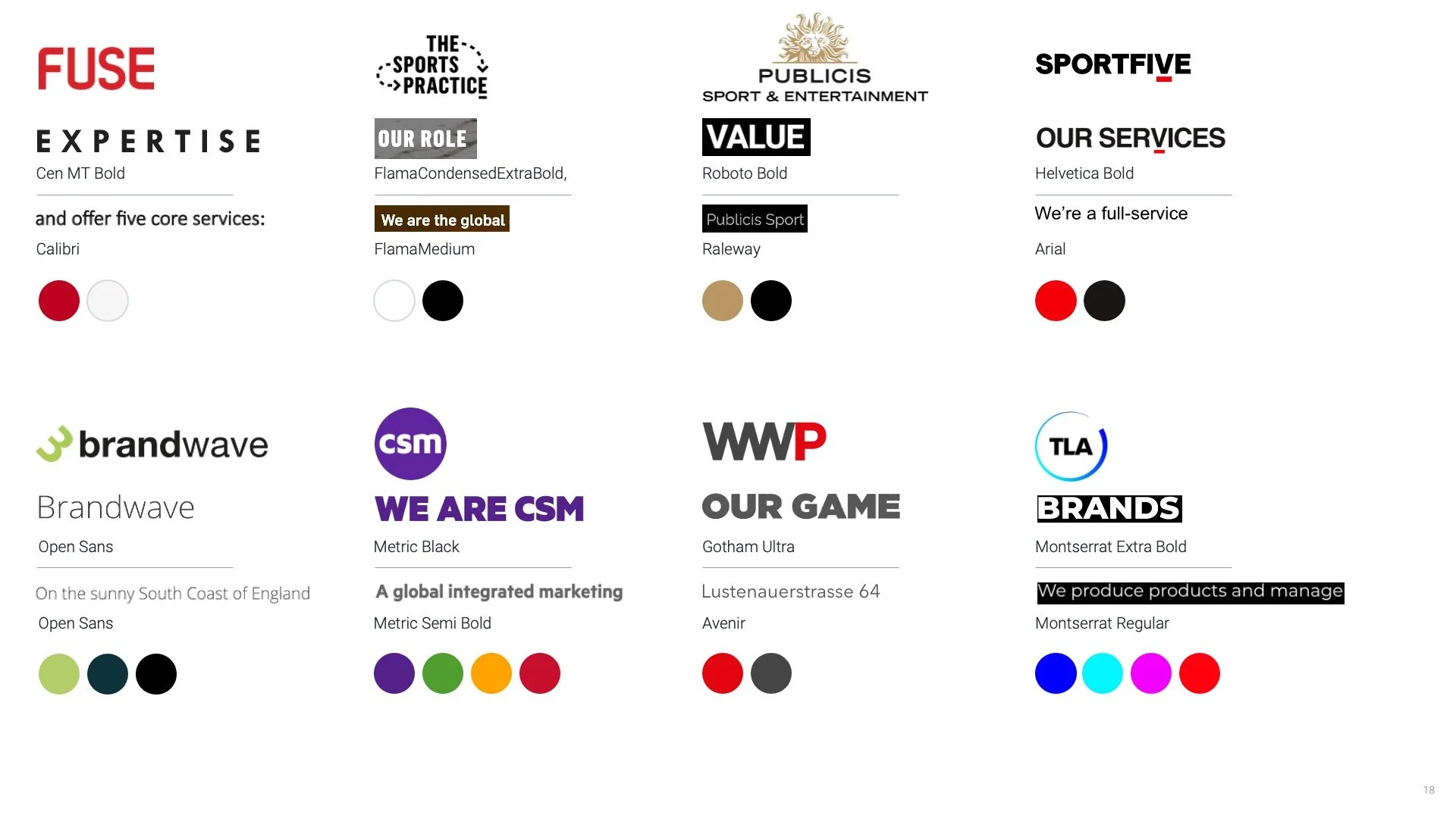
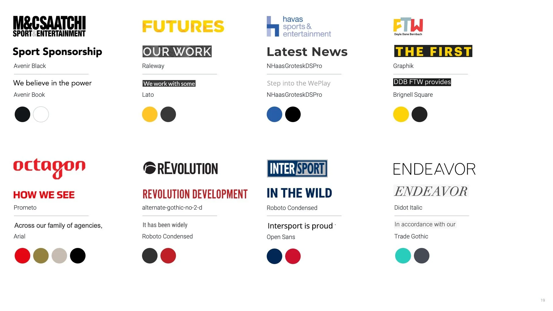
To get a better sense of what OS should look like, I researched competitor marketing agencies.
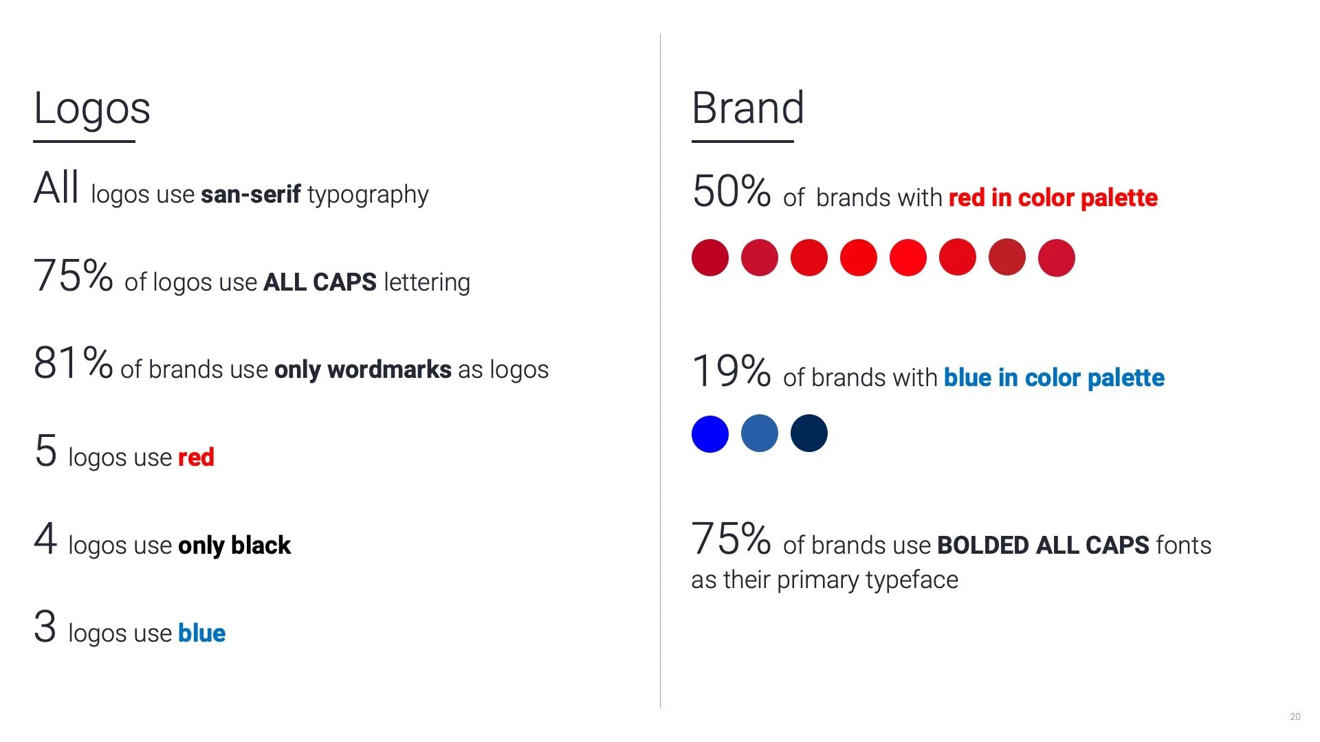
I quantified the visual data that I gathered so that could make actionable design decisions.
LOGO IDEATION
These are a handful of the logos that were created and presented to OS. The goal was to make something with movement that showed optimization and sports coming together.
IDENTITY
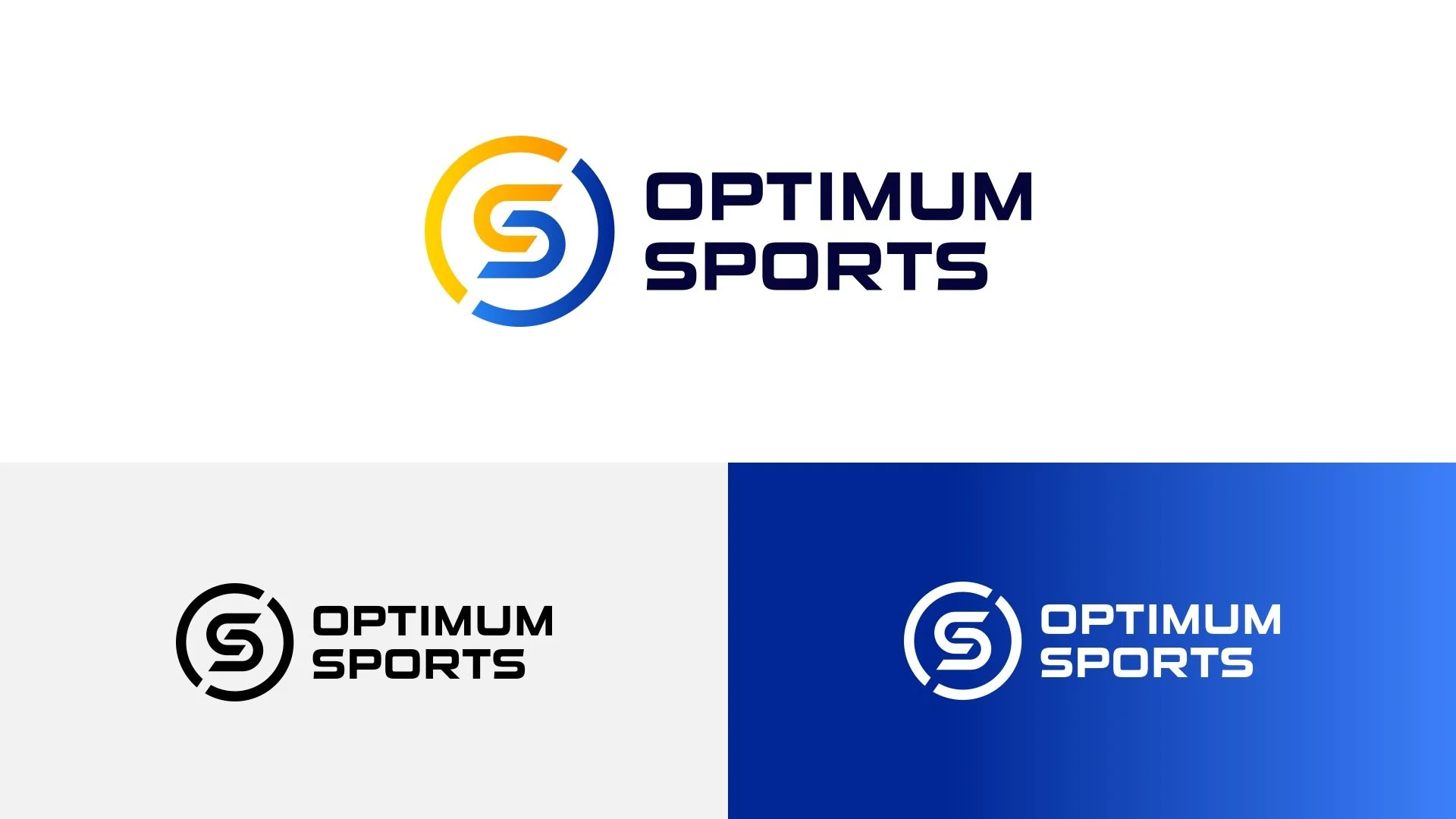
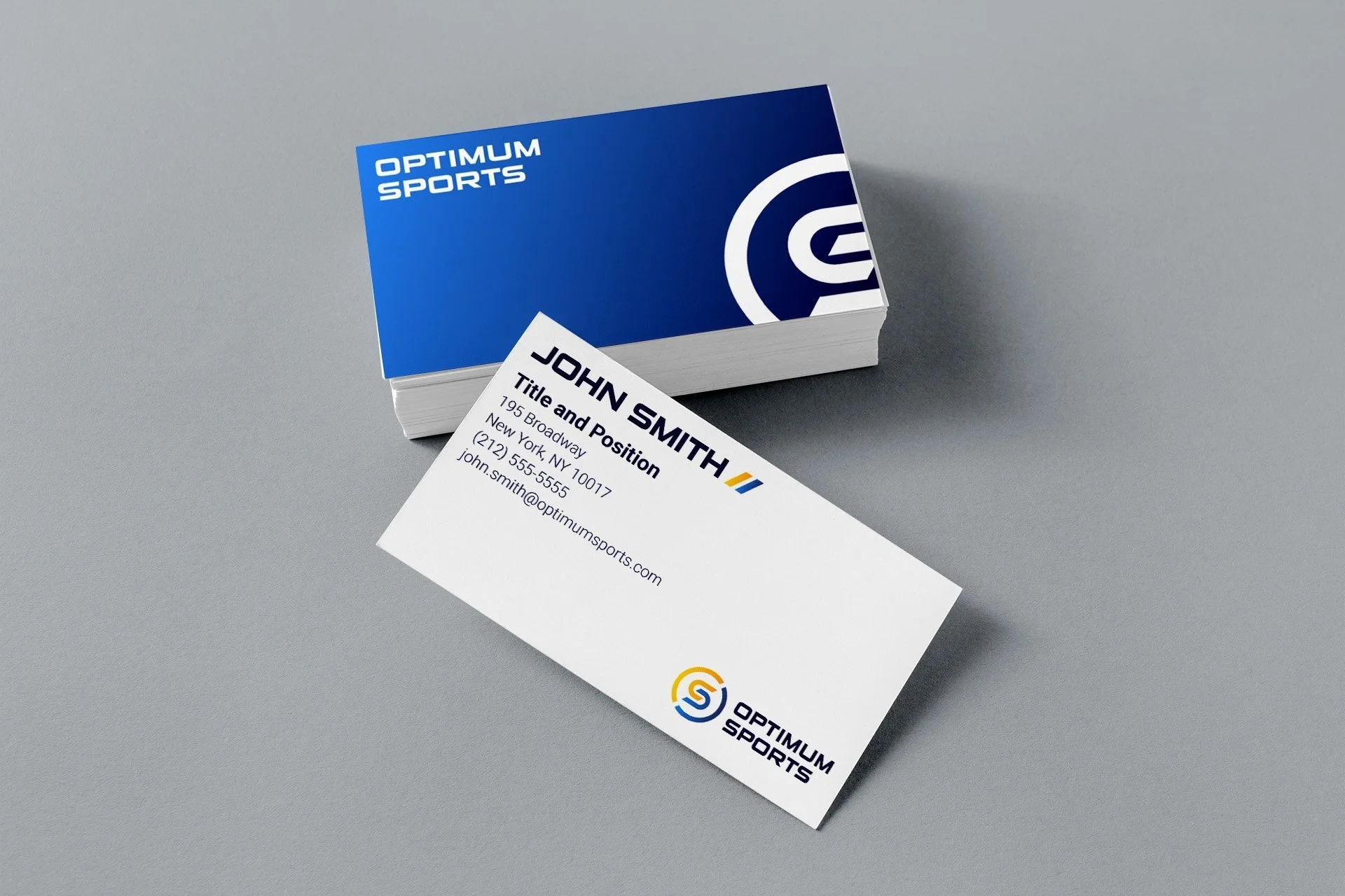
We landed on a logo that best portrayed the idea of interconnection and movement. As an agency, OS is always tuning into sports, extracting data and trying to produce the best results for their clients. This is why in this logo, sports literally lives in a constant state of optimization.
Based on competitive research, we chose blue as the primary color. With about 1/5 of the logos being in that color, it kept us in the space of sports marketing agencies but differentiated us from the majority of brands which were red. To provide contrast from the blues, I also introduced a warmer palette.
