OMG REFRESH
Omnicom Media Group (OMG) is a collective of global media agencies. The challenge was to refresh and build out our branding. We already had a basic visual identity, but as a quickly evolving company, we needed to modernize and more clearly define ourselves.
COLOR PALETTE
We stayed anchored in OMG’s blues but refined the palette to introduce more depth and vibrancy. As OMG is a brand that oversees other brands, it makes sense that their color palette is extensive, lending itself to systemization.
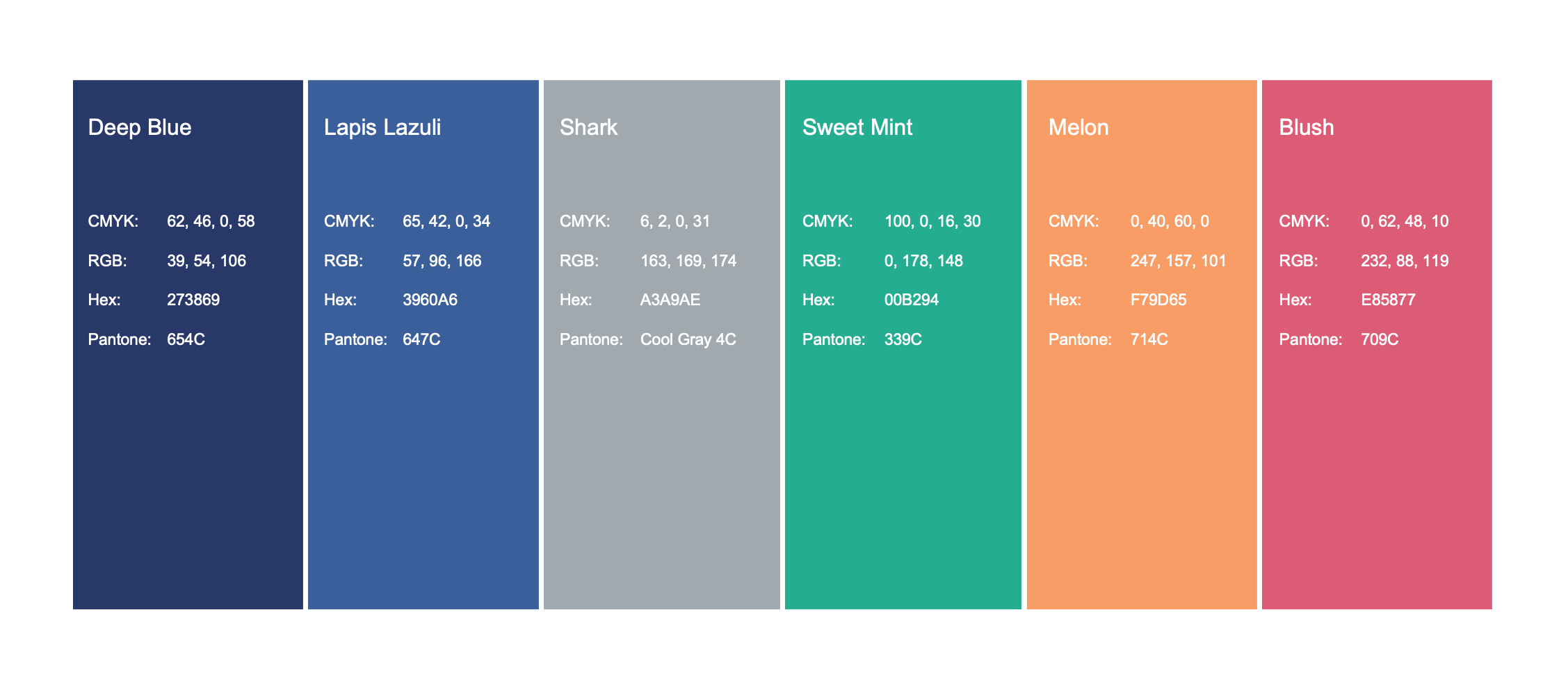
Old
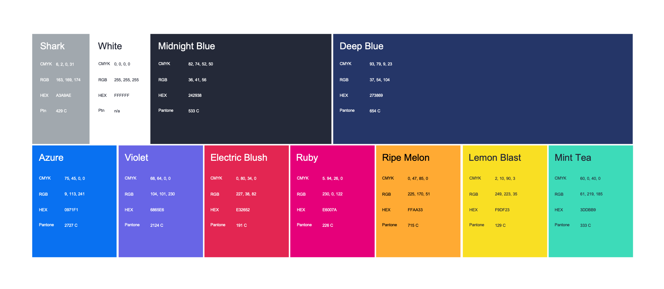
New
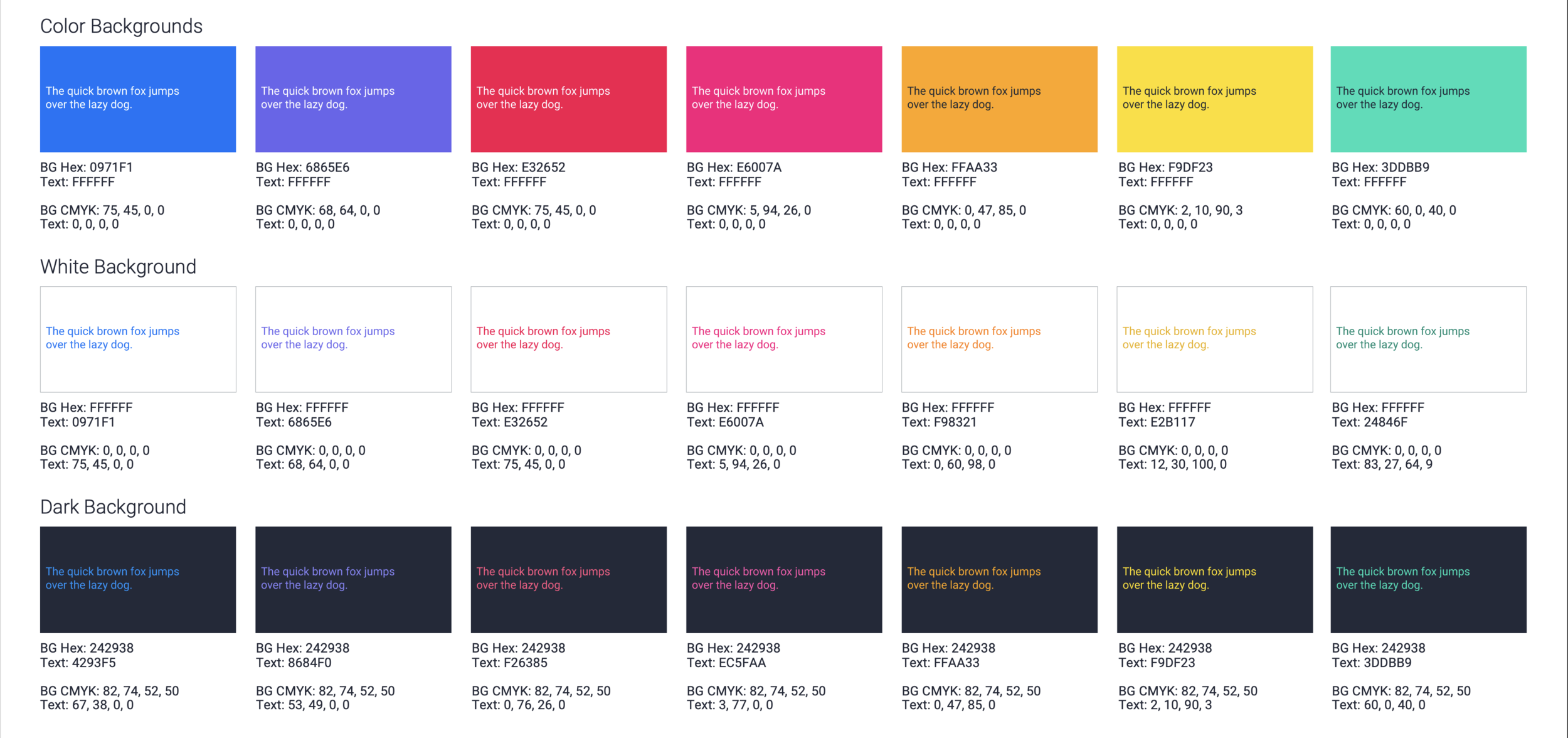
Color Combinations with Text
OMG is a people-powered brand, so we wanted to make sure our designs truly are for everyone. To make text more accessible, we made sure our color combinations were Web Content Accessibility Guidelines (WCAG) AA level compliant.
Gradient Pairings
In our new color system, we introduced a series of gradients to add color, depth and interest to our compositions.

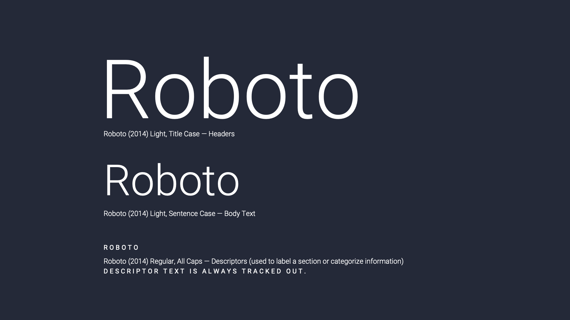
typography
We stayed consistent with OMG’s Roboto family but brought sleekness and refinement to the brand by using a lighter weight.

Old
New
We also developed guidelines for the best typographic practices based on medium.

SYSTEM ELEMENTS
Similar to how we lightened up the typography, we decided to make OMG’s geometry sleeker.

Old

New
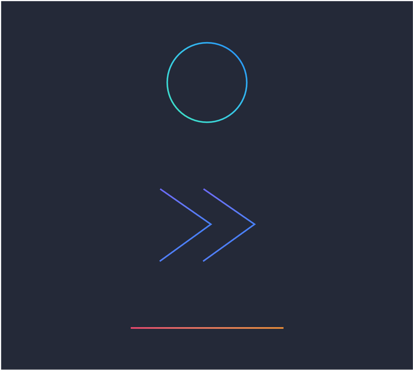
Classic Assets Refreshed
We lightened up our core assets of the chevron, line, and circle to contemporize the brand and provide a more refined feel.
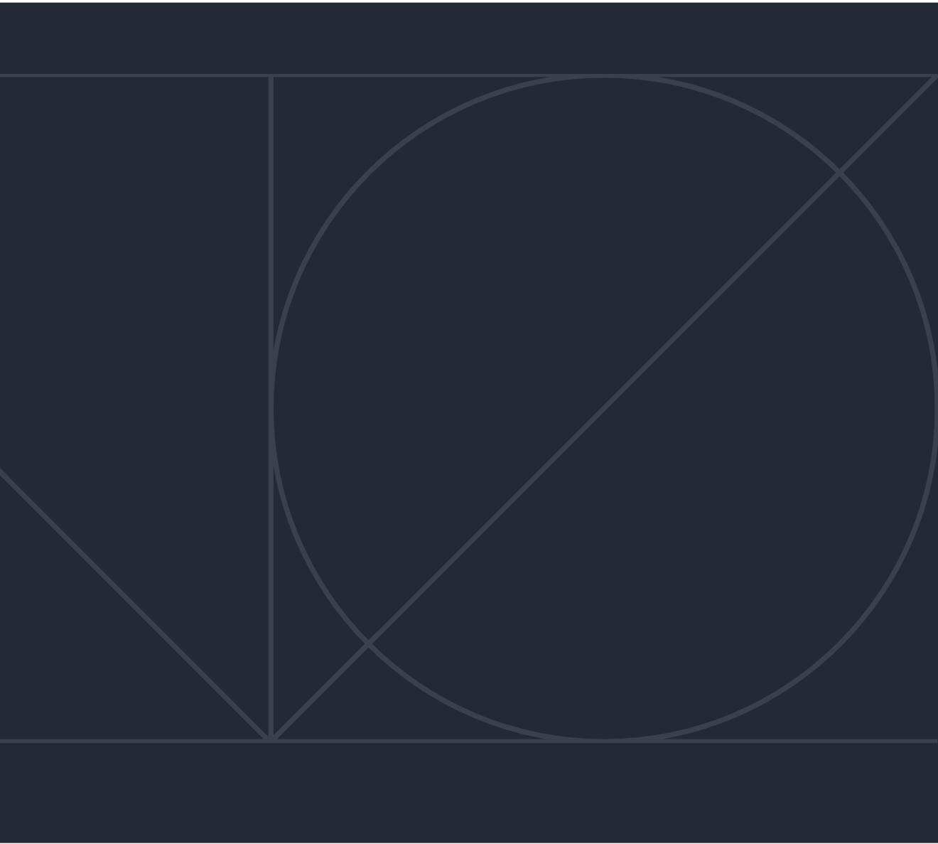
Shapes & Grid
We created a standard 12 column grid which acts as a framework to bring structure and detail to our layouts.
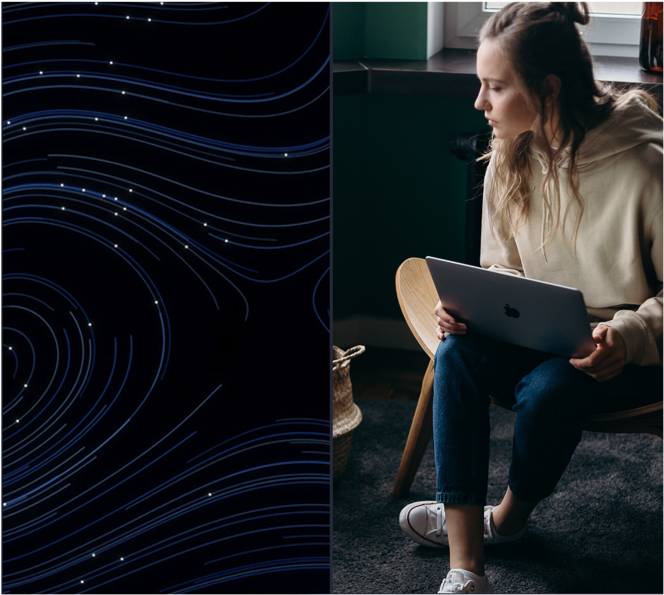
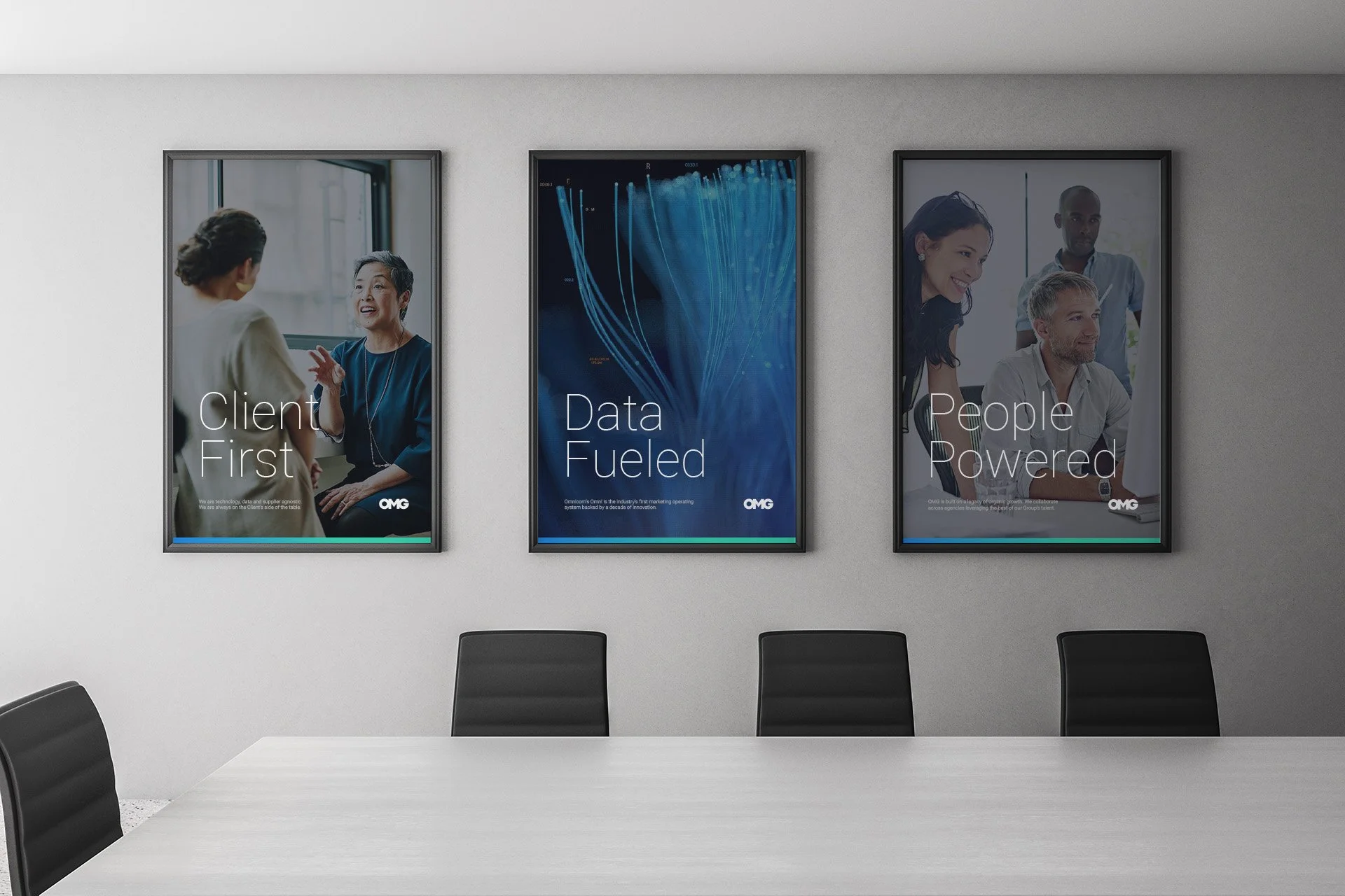
People-Powered
Imagery that expresses interconnection, mixed with authentic, diverse people represents OMG, and the global workforce.